Pretty as a picture: Ten step guide to using artwork effectively in your home
/
Style is an important feature of the home. The way in which we decorate and furnish our living space can have a considerable impact on how relaxed we feel throughout the day.
While the overall feel of a property is affected by many things, there are few finishing touches more important than artwork.
Here, we take a look at how best to use artwork and home accessories to create a nice home environment.
1. Go with your gut
Simple though it sounds, it's important to choose artwork that you like. It's easy to be tempted to choose artwork that you feel might be popular but this can actually have the opposite to the desired effect.
Whether or not the artwork you choose is effective comes down to one thing – whether or not you are happy with it. You should therefore follow your gut reaction to judge what you buy.
2. Placement
Even a great picture can look wrong if it's not properly placed. Consider first whether you have an appropriate space to hang or place a piece of art. You might be particularly careful, for example, about the themes you choose to place in your kitchen or dining room.
Better Homes and Gardens has a fantastic post on how to arrange art which is well worth a read for more information. Looking at everything from placing items above the sofa to using scales, adding visual balance and keeping things level, they have plenty of great ideas for you to try.
3. Framing
It's often the case that the frame can make or break a picture. Sometimes a picture is better off with no frame at all – just a simple mount. Don't be afraid to try different things when it comes to the frame until you get it just right.
4. Lighting
Pieces that make use of colour can be affected a great deal by the light which shines on them. Spare some thought to the way each piece of art is lit and how that might change throughout the day. If it makes a difference, don't write off the idea of including special lighting in the room just to accommodate a certain picture.
5. Context is everything
It's sometimes the case that a picture or sculpture can look great in one environment and terrible in another. While it can be difficult to predict how an item will look in your home, try to be aware of the surrounding colours, shapes and home accessories and the impact they might have on your choice. Items tailored to a children’s bedroom may look out of place in the living room, for example.
6. Link size to space
The difference between how a piece of art looks in the shop and how it looks in your home can also come down to size. A large picture can easily dominate a small room. Similarly, a small piece of art can get lost if place on a large wall.
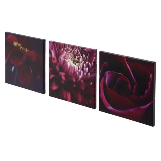
Try to get the scale right when choosing pictures in order to maximise the impact of the art that you choose. Select artwork in sets of three is a good option if you’re unsure what you need.
7. How much is too much?
It's always pleasant to house a wide selection of artwork in your home but that's not to say it's impossible to go over the top. If you place too many pieces of art on the wall, it's possible for each piece to become less effective. Finding a happy medium is hard but essential.
8. Group styles
Try to keep similar styles of art together. While it can be nice to display some variety throughout the home, too much variety within a small space can be confusing.
9. Spacing
Not only is it important to have the right amount of art, but also to have it evenly spaced. Clustering pictures can also detract from their impact, while leaving too much space can make a room feel cold and bare.
10. Be bold!
Finally, don't worry to the point of being conservative. Plain artworks undoubtedly have their place but without a little flare, it's difficult to be unique. If you want to create something totally unique then why not have a stab at some DIY styles? This fantastic post shows 100 creative DIY wall art ideas which really stand out. From making art from sequins to using postcards to create a unique feature, there’s plenty of scope for individuality with wall art.


