Suckered By Naughty But Rice's Package Design Team

image.jpg

I'm a bargain hunter, it's in my genes. From my Gran Phillips teaching me the ways of the reduced counter, to my own mental map of every local supermarket in the area's mark down product section, I'm all about the savings, and rarely care about the packaging. 

However, put something in a retro style design container & I will buy it despite not even particularly liking it- see the 1970s' 7-Up tins that have been available over the summer; I never drink the stuff otherwise. 

Thats where today's product comes in, with its colourful, mid-centuryesque, simple design. I had them in my basket in Sainsburys before I'd even read what they were properly.

image.jpg

What are they then? Fancy rice puddings, with the puntastic name Naughty But Rice. The flavours are Raspberry & Coconut, and Chocolate Orange. There's also a Salted Caramel variety, but Holywood Sainsburys didn't have it in stock.

image.jpg
image.jpg

I wasn't mad about the raspberry one, despite being a coconut fan, but the chocolate orange is AMAZING and is getting bought again. 

As with traditional rice pudding you can serve hot or cold, and they are so filling they could even be a sneaky treat of a breakfast. They also might make a good break to send in to school. Let me know if you try them what you think. 

Sainsburys Christmas Advert has given the UK MOGmania!

Everyone with eyes surely must have seen this year's Christmas advert offering from Sainsburys by now. The nostalgic feast of a mini-movie with our childhood friend Mog the Cat brought to life, and as ever finding herself in mischief. 

image.jpg

If you haven't seen the ad yourself, get on YouTube & give yourself a treat. It's had 13 MILLION views since it launched 8 days ago.

But if you haven't seen it then anyone with ears surely must have HEARD about the resulting Mog-mania, and stores across the country selling straight out of plush Mogs the same day they come in stock. 

You can  order and buy the Christmas Calamity Mog book online for just £3, with the majority of that going to charity to help child literacy in the UK. You can't however get your paws on the plush Mog toys on the website. They are like gold dust. Some eBay sellers are stocking them with prices between £30 and £100. Considering the toy is sold for charity, and that these bulk buyers are taking away the chance of a child buying a £10 toy instore, I can't help but feel quite cross and hoping these folks end up with coal in their stockings from Santa this year.

I was thrilled to be able to get the Mog book in Sainsburys in Bangor NI last week. I think there were four or five copies left, so I was lucky. They had zero plush toys though. I took a notion to phone them this morning to ask the questions they must answer a hundred times a day, "when is your next batch of Mog toys due in stock?". They told me they don't think they'll get another shipment at all. So I tried Sprucefield, who said no, but they thought Forestside & Holywood had some arriving today.  

image.jpg

I phoned, then dashed up in the car to Holywood and got THE LAST MOG. Smix is over the moon (& so am I). So my suggested Mog obtaining strategy is phone around stores. If you're quick today, the Holywood store still had a large number of the books, but I imagine they'll be gone by tomorrow too. Good luck!

Pretty as a picture: Ten step guide to using artwork effectively in your home


Style is an important feature of the home. The way in which we decorate and furnish our living space can have a considerable impact on how relaxed we feel throughout the day.

While the overall feel of a property is affected by many things, there are few finishing touches more important than artwork.

Here, we take a look at how best to use artwork and home accessories to create a nice home environment.

1. Go with your gut

Simple though it sounds, it's important to choose artwork that you like. It's easy to be tempted to choose artwork that you feel might be popular but this can actually have the opposite to the desired effect.

Whether or not the artwork you choose is effective comes down to one thing – whether or not you are happy with it. You should therefore follow your gut reaction to judge what you buy.

2. Placement

Even a great picture can look wrong if it's not properly placed. Consider first whether you have an appropriate space to hang or place a piece of art. You might be particularly careful, for example, about the themes you choose to place in your kitchen or dining room.

image.jpg


Better Homes and Gardens has a fantastic post on how to arrange art which is well worth a read for more information. Looking at everything from placing items above the sofa to using scales, adding visual balance and keeping things level, they have plenty of great ideas for you to try.

3. Framing

It's often the case that the frame can make or break a picture. Sometimes a picture is better off with no frame at all – just a simple mount. Don't be afraid to try different things when it comes to the frame until you get it just right.

4. Lighting

Pieces that make use of colour can be affected a great deal by the light which shines on them. Spare some thought to the way each piece of art is lit and how that might change throughout the day. If it makes a difference, don't write off the idea of including special lighting in the room just to accommodate a certain picture.

5. Context ieverything

It's sometimes the case that a picture or sculpture can look great in one environment and terrible in another. While it can be difficult to predict how an item will look in your home, try to be aware of the surrounding colours, shapes and home accessories and the impact they might have on your choice. Items tailored to a children’s bedroom may look out of place in the living room, for example.

image.jpg


6. Link size tspace

The difference between how a piece of art looks in the shop and how it looks in your home can also come down to size. A large picture can easily dominate a small room. Similarly, a small piece of art can get lost if place on a large wall.

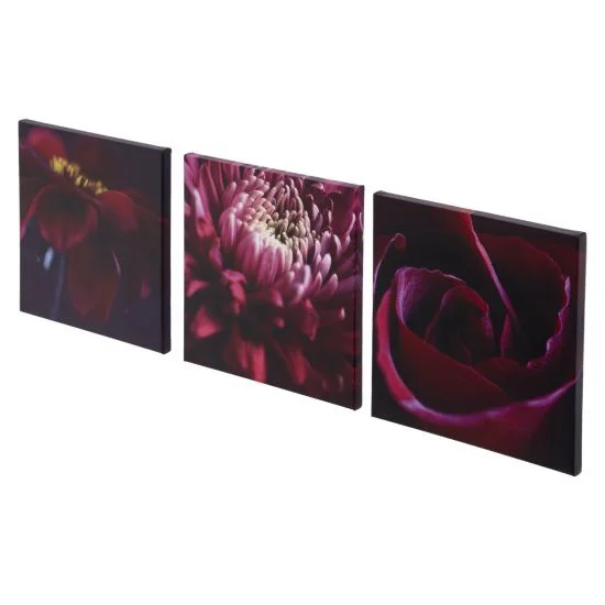
Try to get the scale right when choosing pictures in order to maximise the impact of the art that you choose. Select artwork in sets of three is a good option if you’re unsure what you need.

image.jpg


7. How much itoo much?

It's always pleasant to house a wide selection of artwork in your home but that's not to say it's impossible to go over the top. If you place too many pieces of art on the wall, it's possible for each piece to become less effective. Finding a happy medium is hard but essential.

8. Group styles

Try to keep similar styles of art together. While it can be nice to display some variety throughout the home, too much variety within a small space can be confusing.

9. Spacing

Not only is it important to have the right amount of art, but also to have it evenly spaced. Clustering pictures can also detract from their impact, while leaving too much space can make a room feel cold and bare.

image.jpg


10. Be bold!

Finally, don't worry to the point of being conservative. Plain artworks undoubtedly have their place but without a little flare, it's difficult to be unique. If you want to create something totally unique then why not have a stab at some DIY styles? This fantastic post shows 100 creative DIY wall art ideas which really stand out. From making art from sequins to using postcards to create a unique feature, there’s plenty of scope for individuality with wall art.