The Planet's Ugliest Websites?
/Putting together this post made me a little nostalgic. I've had my own badly cobbled together website since the late 1990s. I was desperately trying to remember the Freeserve address to locate it with the Way Back Machine, but alas it's lost to the sands of time.
Back then, the landing page and animated gif were king. Scrolling marquees & putting little quizzes on your homepage made you a god of the Internet. I spent hours fiddling with designs, always to lazy to ACTUALLY learn how to code (imagine if I'd taken the time!) & I can embarrassingly admit I STILL don't know basic HTML. But I can always get a buzz going about whatever I have managed to throw at the web, which has led to where I am now.
These days I still use templates and behind-the-scenes hosting, and everything these days is far more accessible for anyone. You can put together a website for your small business by yourself- no third party consultant fees, or by the hour tech support needed. It's as simple and click and dropping elements on a screen.
You can find out how to build your own website at 1&1, and be in control of the whole project. They'll also help you avoid falling into design traps such as these busy home pages.
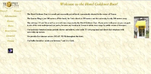
But now, a look back at the website designs of old. For you young ones, this is what the web looked like 15 years ago. I don't escape either- the final screen shot is my own website Rudedoodle.tk in 2006. Before everyone had digital cameras, never mind iPhone cameras, used to take photos of bands that played Belfast (from about 2001-2004). It was a messy time, but one I treasure.


